Visual Design
Refreshing a brand identity

UI/UX Design
Graphic Design
2 Marketers
2 Insurance Experts
2 Developers
3 months
Figma
Adobe Illustrator
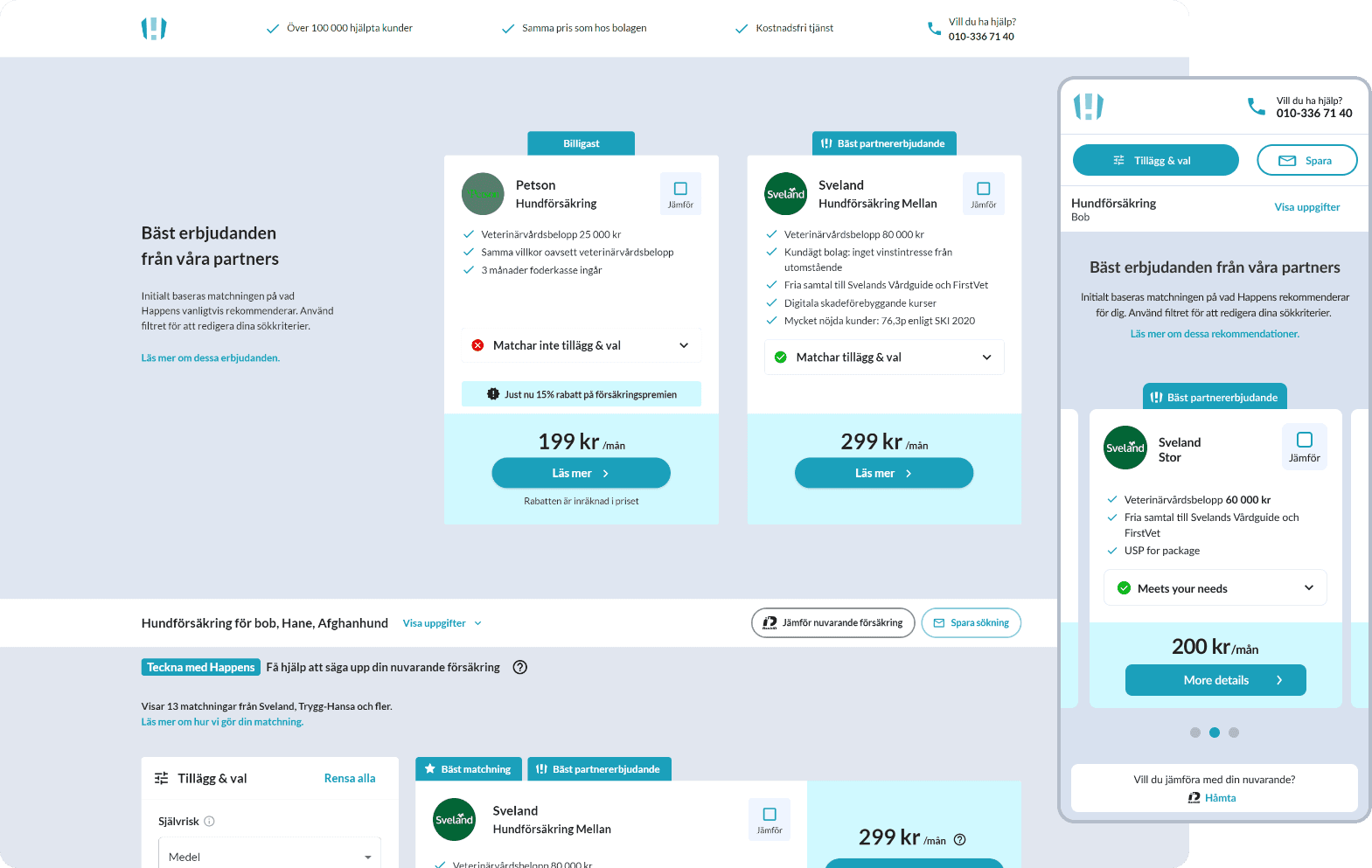
Happens is a Swedish insurance comparison website started in 2021, that helps users find insurance policies that best match their needs, and not just their budget. Users are able to digitally sign insurances through the Happens platform with various partnered providers.
Discovery
Challenges with the current logo and colours
Mix of upper and lower case (brandmark and type) makes the logo look a bit strange
The platform was leaning more toward a softer design, with a lot of rounded corners - so the logo now looked too sharp in comparison.
The blue colours were deemed not impactful enough for where the brand was heading.
As well as these points, the team no longer liked the colour scheme of the platform, and wanted me to explore other colours to 'refresh' the brand as the colour scheme and logo had been the same since launch several years ago. Below are the original colours with my design built onto it over the previous year.
iteration
This project needed to be completed quickly as marketing were launching new marketing materials so I needed to take a decisive path with the feedback received and iterate efficiently.
Use a rounder or wider typeface, a font that is ‘friendly’ and matched the softer redesign of the rest of the website.
Add a warmer colour tone that would communicate the same friendliness while maintaining the professional nature of the business.

For colour we whittled it down to purple, red or black with white and decided through a quick workshop where i iterated through an array of colours and the team gave their opinion. My preference was a vibrant purple, since this would really freshen up the entire platform.
