Product Design
UI/UX Design
Research
Improving the customer journey to increase sales

Research
Conceptualisation
Design
Testing
Dev handoff
2 Developers
1 Insurance Expert
3 months
Figma
Amplitude
Happens is a Swedish insurance comparison website that helps users find insurance policies that best match their needs, and not just their budget. Users are able to digitally sign insurances through the Happens platform with various partnered providers.
In 2023, we were looking at ways to improve sales conversion and also lean Happens towards being an insurance advisor and not just an aggregator. Before I joined Happens, there was no user experience designer so I was now tasked with going back to the drawing board and seeing if things could be done differently and better.
Background
My Role
Discovery
The Problem
Data showed that the conversion rate between the comparison results page and the policy signing page was not performing as well as expected. Users were viewing their search results and not clicking to purchase any of the policies they were shown and therefore we were losing potential sales.
User analytics showed that:
Of the users entering the results page from the KYC, 75% were dropping off - leaving without selecting a result.
Of the users that did click "Continue" (which entered the purchase process directly) , 80% u-turned or exited from the platform.
I conducted interviews with six users to understand the problem better. Based on user feedback and feedback coming from sales, I identified that improvements could be made.
Discovery
Synthesising the insights
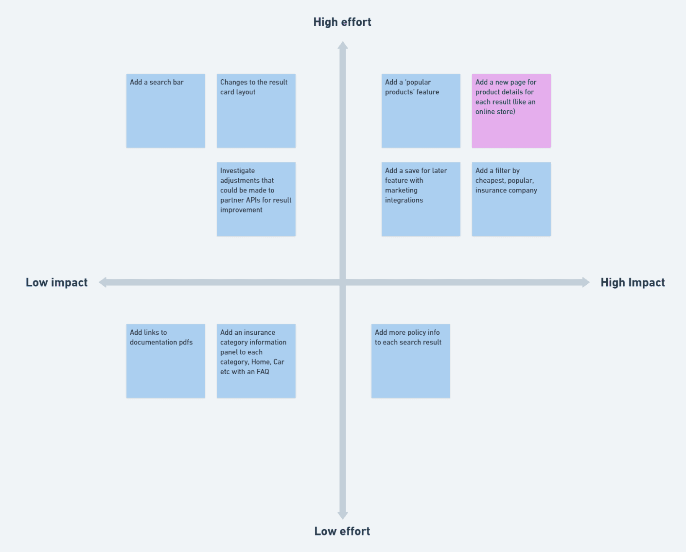
I ran a workshop to summarize these insights and to brainstorm solutions. Gathering technical, design and insurance experts all together meant we were all able to offer a different perspective. During the workshop we also looked at competitor product pages to help us understand user expectations. Needing to visualize our ideas, I started wireframing during the session taking suggestions from the team.
A secondary outcome of the workshop was a desire to incorporate more insurance information into the product details. This was because the business goals was changing more towards an advisory role and stakeholders were not happy for the platform to be seen as "just another aggregator".
Hypothesis
How can we engage our users better to convert to sale?
Instead of viewing our flow as only a comparison aggregator where we show results and then push the user through to an insurance sign form, we should consider that users are far more used to an online shopping experience that involves more steps before commitment.
In short, a user expects to click on a product and find out more about the product before making a purchase decision. This would also provide a solution for adding more insurance information and aligning with business goals.
Here is a simplified diagram of the current flow:
KYC
Comparison Results
Buy Insurance
And after:
KYC
Comparison Results
Product Details Page
Buy Insurance


Design
Iterating and Testing
For this particular project wireframes were sketched out during the workshop as we brainstormed what sections should be included.
With all the necessary foundations and knowledge in place for the MVP, Imoved onto low fidelity prototyping with active feedback from the team as I iterated. We then did a small feedback round with some users, and added some additional features such as:
Some users didn't understand what some of the policy addons were or what the benefits could be so I added expandable help sections to each addon so the user could see more context if they needed it.
I moved the layout into a single column as having to columns of information seemed to be overwhelming the users we tested with. This also meant that the layout would be the same on desktop and mobile which simplified the process for Dev.